Netshark Academy
-
Home
-
Netshark Academy

Netshark Academy

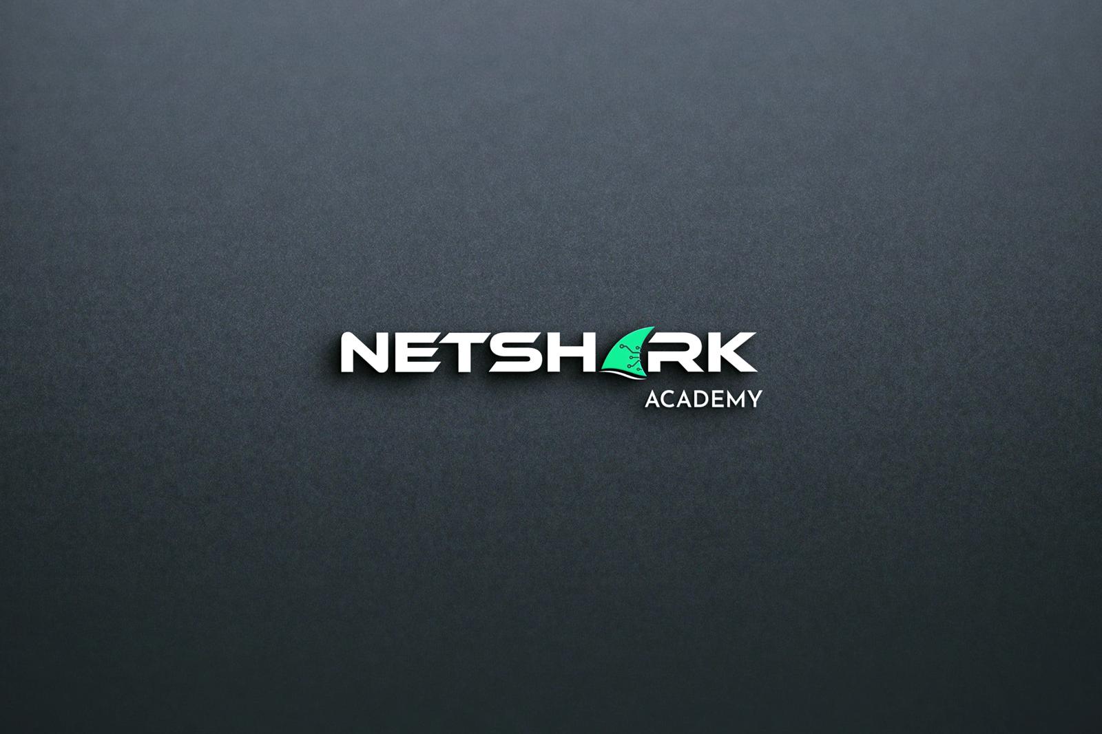
Logo Design for a coaching institute
Visit the website: https://netsharkacademy.com
Concept
The Netshark Academy logo represents intelligence, speed, and mastery — qualities that define a modern coaching institute committed to academic growth and competitive excellence. The design merges the symbolism of a shark—known for focus, precision, and leadership—with the digital, network-oriented identity suggested by the word “Net”.
The resulting icon forms a dynamic, streamlined mark that embodies:
Sharp focus and clarity required for academic training
Strength and forward momentum symbolizing student progress
Modern digital learning, reflecting online and hybrid coaching methods
Strategic growth — guiding students toward higher achievements
The interplay of bold lines and angular shapes conveys discipline and confidence, while clean geometry ensures the brand appears professional, trustworthy, and education-focused.
Design Process
1. Research & Analysis
We studied the landscape of coaching institutes, competitive exam brands, and tech-enabled academies. Key goals identified were:
A logo that appeals to students and parents, signaling reliability
A modern identity that stands apart from traditional coaching logos
A symbol that captures both academic sharpness and digital fluency
Strong visual recognition suitable for digital learning environments
Insights from this research guided us toward a design that feels energetic, smart, and future-ready.
2. Sketching & Ideation
The brainstorming phase involved exploring multiple visual metaphors:
Shark fin shapes representing focus and confidence
Book pages, learning curves, and upward growth arrows
Network lines and digital nodes for tech-forward learning
Abstract forms merging an “N” and “A” into a unified monogram
The priority was to ensure the shark element remained subtle and symbolic, avoiding literal illustrations while preserving the essence of strength and precision.
3. Digital Refinement
The chosen direction was refined into a bold, minimal mark that combines:
A stylized shark fin emerging forward, symbolizing leadership and progress
Geometric precision, reflecting structured coaching and disciplined learning
Balanced negative space to maintain clarity at small sizes (app icons, badges, certificates)
A modern sans-serif wordmark that feels clean, confident, and academic
Color palette considerations included deep blues (trust, intelligence) and contemporary gradients for tech-driven appeal.
4. Testing & Delivery
To ensure versatility, the logo was tested across:
Mobile and desktop learning dashboards
Print materials like ID cards, certificates, and prospectuses
Classroom signage and digital screens
Social media thumbnails and banners
Merch such as folders, stationery, and apparel
Every version was optimized to maintain sharpness, legibility, and consistency.
Features
✔ Strong and sharp symbol, reflecting focus and academic excellence
✔ Modern and digital-friendly design suitable for online learning
✔ Scalable icon that works on app icons, badges, and print materials
✔ Clean geometric structure for a professional and trustworthy impression
✔ Balanced branding system that blends strength with approachability
Applications
Coaching center signboards and classroom branding
Student ID cards, certificates, and progress reports
Website, LMS dashboards, and mobile app icons
Digital course thumbnails and social media promotion
Stationery, folders, notebooks, and training materials
T-shirts, bags, and academy merchandise
Brand Message
The Netshark Academy logo symbolizes smart learning, speed of understanding, and strategic mastery. It communicates the academy’s core belief: empowering students to move forward with confidence, discipline, and excellence — just like the shark that leads the ocean with purpose and precision.
Share this service:
Interested in working with us?


