ARJE Investment
-
Home
-
ARJE Investment
ARJE Investment
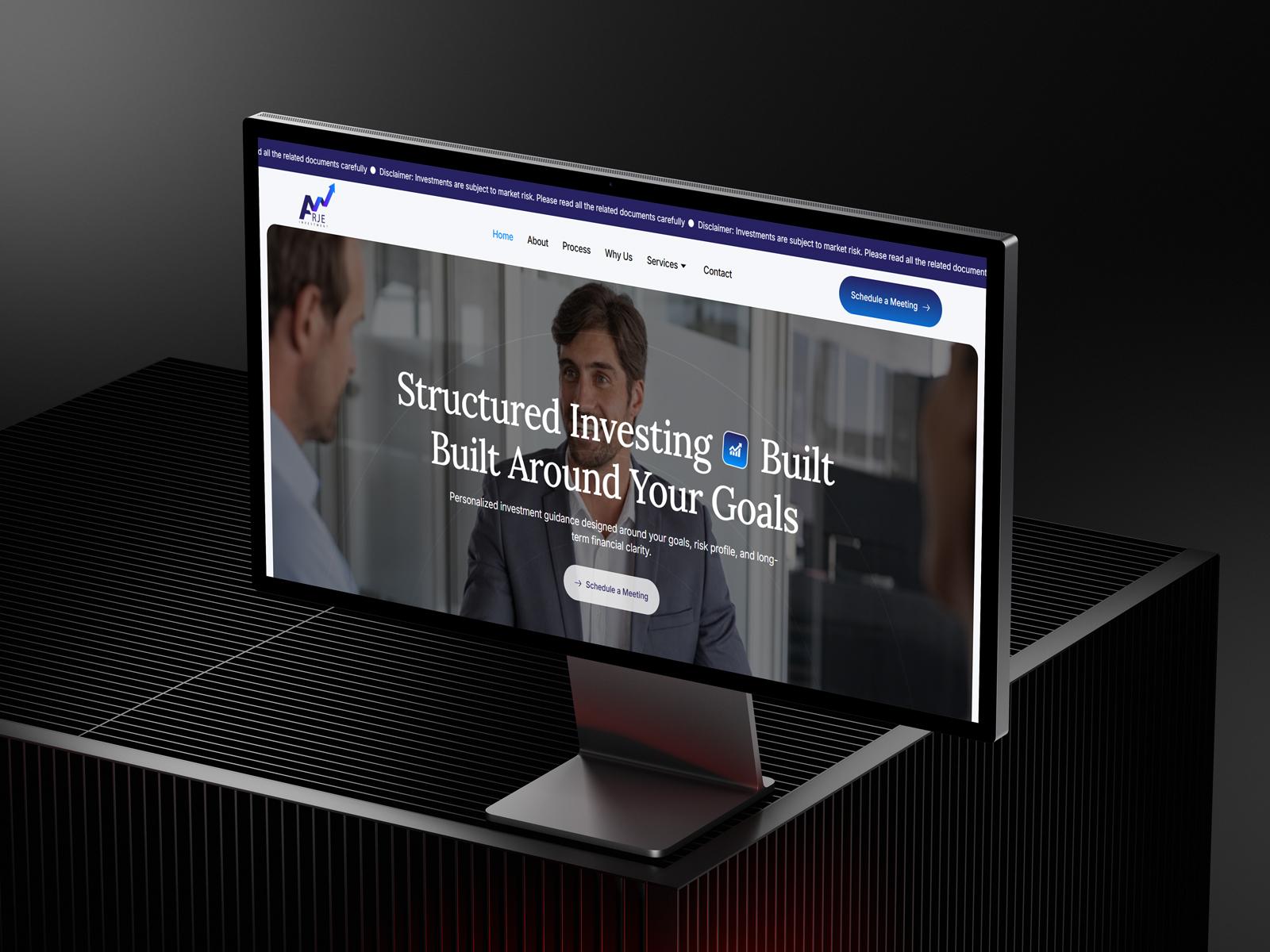
Logo Design for an investment consultancy firm
Concept
The Arje Investment logo is built around the idea of financial growth, strategic progression, and upward momentum. The core visual element — a rising arrow integrated into the letterform structure — directly represents market growth, profitable investments, and forward-thinking financial strategies.
The bold “A” acts as a strong foundation, symbolizing stability and trust, while the dynamic arrow cutting through the form transforms the identity into a visual representation of continuous growth and data-driven decision-making.
The concept clearly communicates:
- Upward financial growth and returns
- Strategic movement and progress in investments
- Confidence and reliability in financial consulting
- A modern, tech-aware approach to finance
The fusion of typography and symbol creates a single, cohesive mark that is both meaningful and instantly recognizable.
Design Process
1. Research & Analysis
We studied financial and investment brands to identify key visual patterns that communicate trust, growth, and professionalism. The goal was to create a logo that:
- Instantly conveys financial growth and success
- Feels modern and dynamic, not traditional or outdated
- Works well across digital platforms and corporate materials
- Appeals to both new-age investors and experienced clients
This led to focusing on growth-driven visual metaphors, especially upward movement and data representation.
2. Sketching & Ideation
The concept development explored:
- Growth charts and market trend lines
- Upward arrows integrated into letterforms
- Monogram structures using “A” and “R”
- Zig-zag financial graphs representing market movement and analytics
The final direction emerged from combining a financial growth graph with a bold “A” structure, ensuring both symbolism and brand identity are merged seamlessly.
3. Digital Refinement
The final logo was refined into a sharp, modern composition featuring:
- A zig-zag arrow path, resembling a stock market growth chart
- A strong geometric “A” base, reinforcing stability and authority
- A gradient transition (purple to blue) symbolizing innovation, technology, and forward-thinking finance
- Clean, bold typography for “ARJE”, ensuring clarity and professionalism
- Spaced-out lettering for “INVESTMENT” to give a premium and corporate feel
The arrow not only adds motion but also creates a visual narrative of growth over time.
4. Testing & Delivery
The logo was tested across various real-world applications:
- Website headers and financial dashboards
- Business cards and corporate stationery
- Investment reports and presentations
- Social media branding and ads
- Office signage and digital displays
Special attention was given to ensure the gradient arrow remains visible and impactful across both light and dark backgrounds.
Features
✔ Strong growth-oriented symbol (arrow + graph integration)
✔ Bold and stable base structure representing trust
✔ Modern gradient palette reflecting innovation and digital finance
✔ Clean and scalable design for all platforms
✔ Unique integration of typography and icon into a single visual system
Applications
- Corporate website and dashboards
- Investment reports and presentations
- Business cards and official documents
- Social media branding and ads
- Office signage and branding materials
- Marketing brochures and client proposals
Brand Message
The Arje Investment logo represents a brand that is driven by growth, guided by strategy, and built on trust. It visually communicates the firm’s commitment to helping clients navigate financial markets with confidence, turning data into decisions and opportunities into long-term success.
The rising arrow stands as a promise — your investments are always moving forward.
Share this service:
Interested in working with us?